The Definitive Windows 8 Review And User Guide
The new version of Windows is now available on store shelves, and we have the complete lowdown on Microsoft's latest operating system. Join us as we thoroughly dissect the Windows 8 UI (Metro), Apps, Desktop, Gestures, IE10, SkyDrive, and Windows Store.
The Windows 8 Desktop And Task Manager
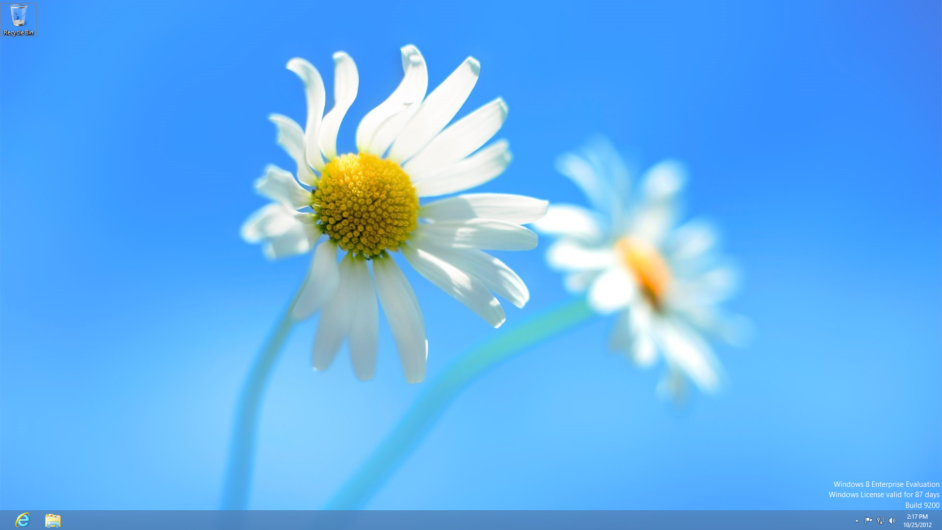
One of the first realities that power users will need to accept is that everything about the traditional Windows experience, which we're all pretty familiar with, is now contained within an app. That is to say the Desktop and every application running on it is treated as one of the Windows 8 UI's apps. The Desktop can even be launched from the Start screen, just like any other app.
As bizarre as that sounds, there isn't much fundamentally different in the Windows 8 Desktop than there was under Windows 7. Aside from the missing Start menu, Windows 8 does away with the Aero theme, it adds a ribbon-style file menu to File Explorer, and it features an enhanced (and also simplified) Task Manager.
Start Menu
Article continues belowAlas, the Start button and its associated pop-up menu didn't make the cut for Windows 8. We know that the Start screen replaces the Start menu, but what about the Start button? Although there isn't a Start button attached to the taskbar in Windows 8, if you move your mouse cursor to the bottom-left corner, a sneaky auto-hide Start button appears.
The button is actually an accurate representation of your Start screen layout. If you move your tiles and groups around, the little squares on the hidden Start button change accordingly, too.
Aero
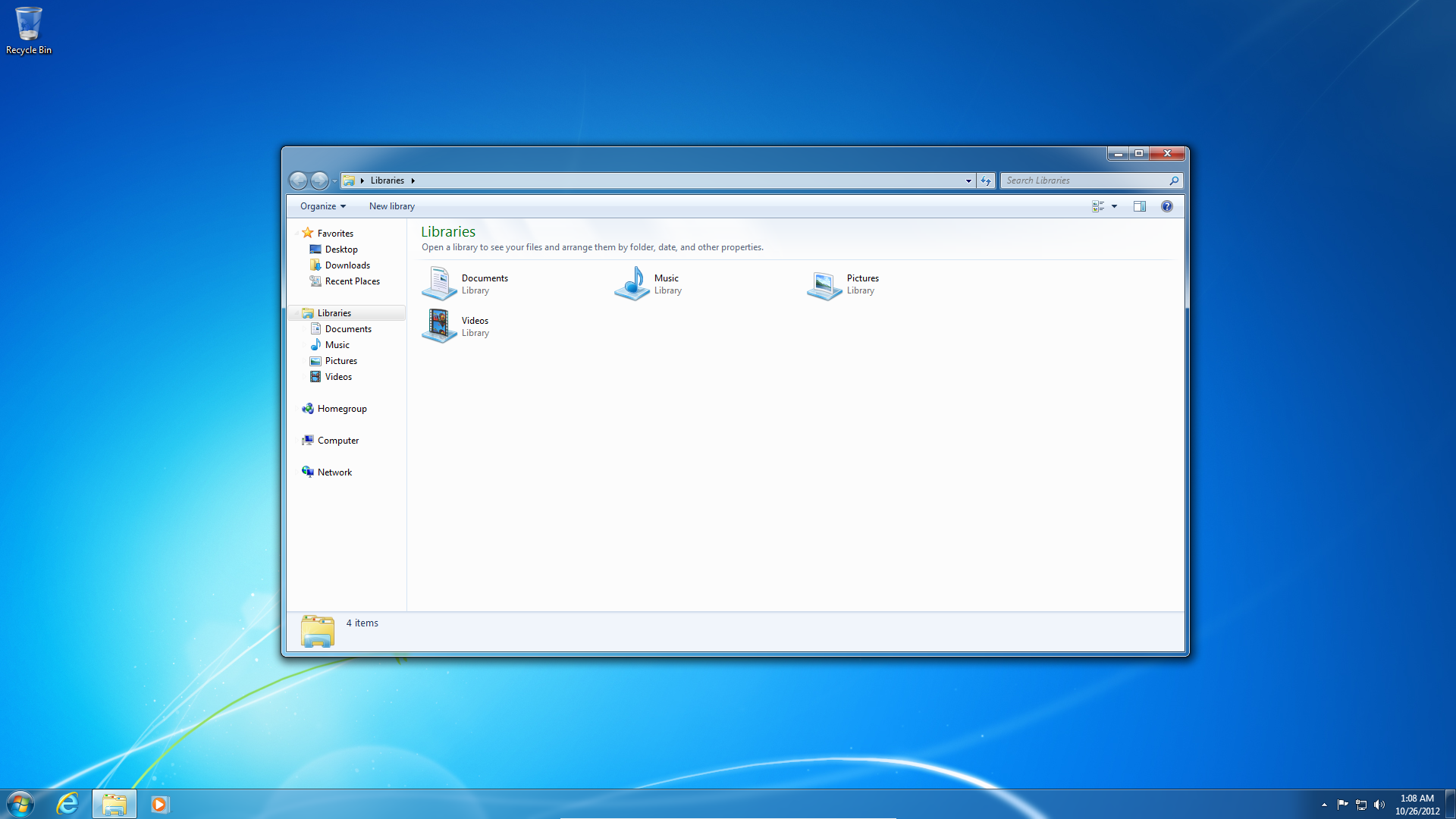
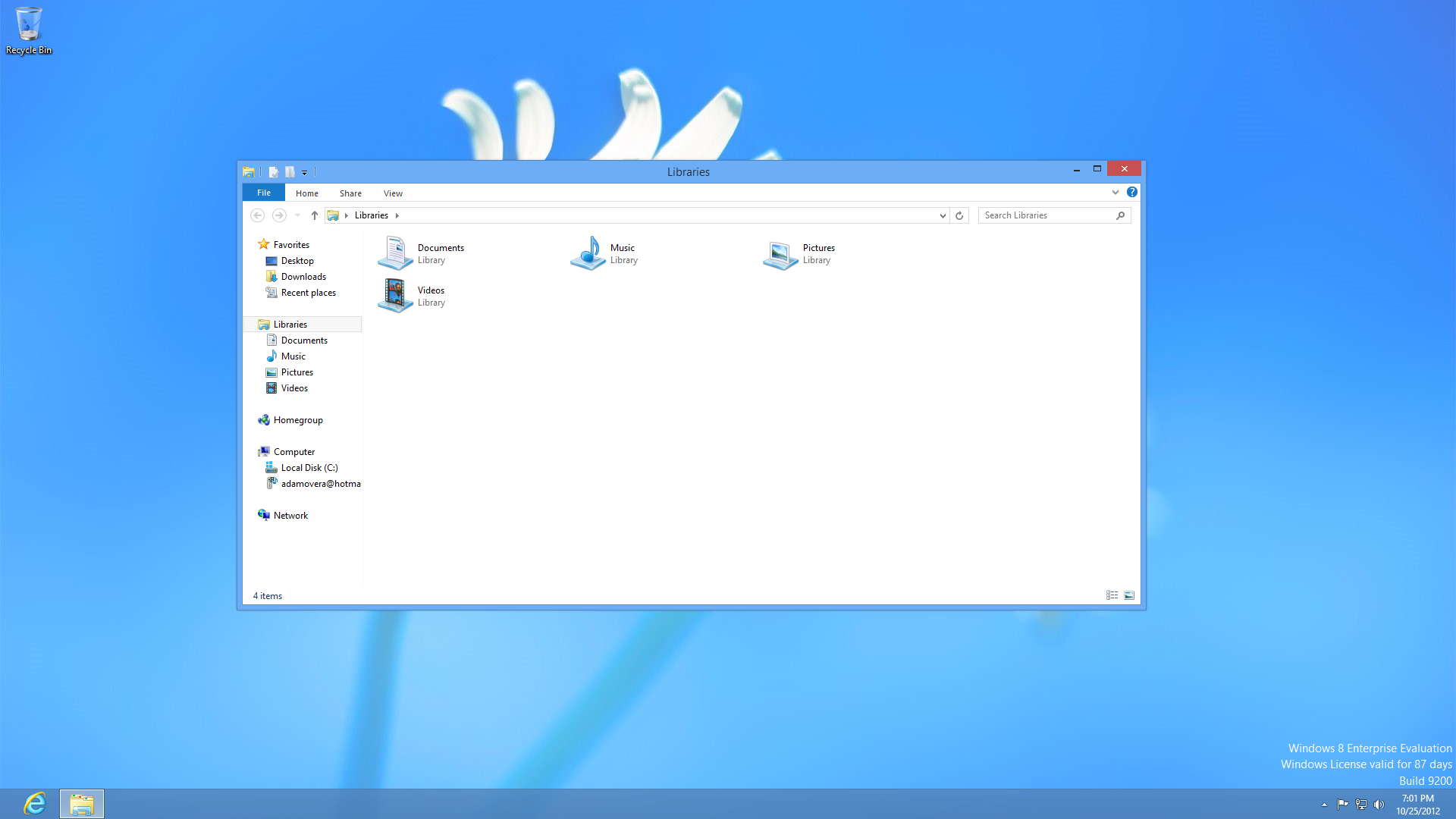
By ditching Aero, windows no longer appear to be made of translucent glass. Also missing are the drop shadows, which conveyed depth in Windows Vista and 7.
Get Tom's Hardware's best news and in-depth reviews, straight to your inbox.
Instead, the Windows 8 taskbar and window borders are flat and square. Those borders now take on solid colors, while the taskbar transparency is toned-down to the point of being barely opaque.
Though the Aero theme is no more, Windows 8 retains its Snap, Peek, and Shake features, which were originally introduced as Aero Snap, Aero Peek, and Aero Shake.
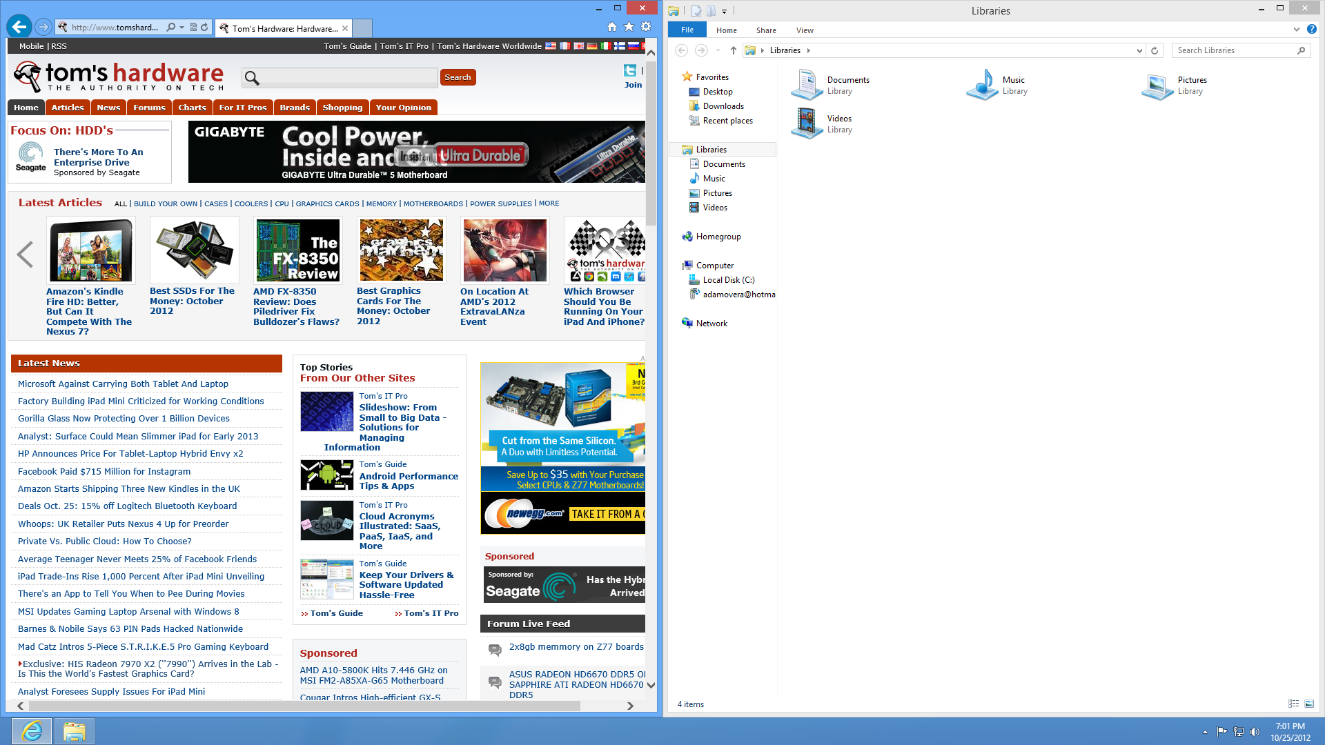
Dragging a window by its title bar to either side of the screen still snaps it, maximizing it to one-half of the desktop.
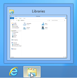
Hovering the mouse cursor over any taskbar icon still generates a thumbnail preview of that application's windows and/or tabs, and shaking a window still minimizes all other windows.
File Explorer
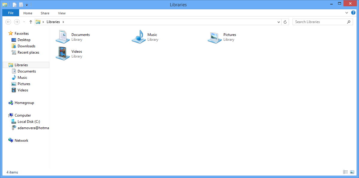
File Explorer is Windows 8's reworked file manager, formerly known as Windows Explorer. The new file manager gains a ribbon-style file menu and new Quick Access Toolbar.
The Quick Access Toobar is essentially a set of small icons for common file manager operations. It sits right in the window title bar, directly to the right of the app icon. By default, the File Explorer's Quick Access Toolbar sports the Properties and New Folder icons, though Undo, Redo, Delete, and Rename can also be added.
The new file menu contains File, Home, Share, and View menus.
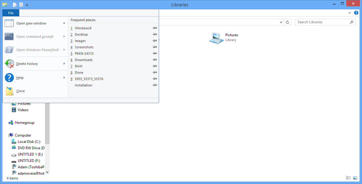
The File menu pops out, somewhat like an upside-down Start menu, to reveal the options to "Open new window", "Open command prompt", "Open Windows PowerShell", Delete History, Help, and Close. Other than Close, all menu items have sub-menus with additional options like opening the command prompt as an administrator.
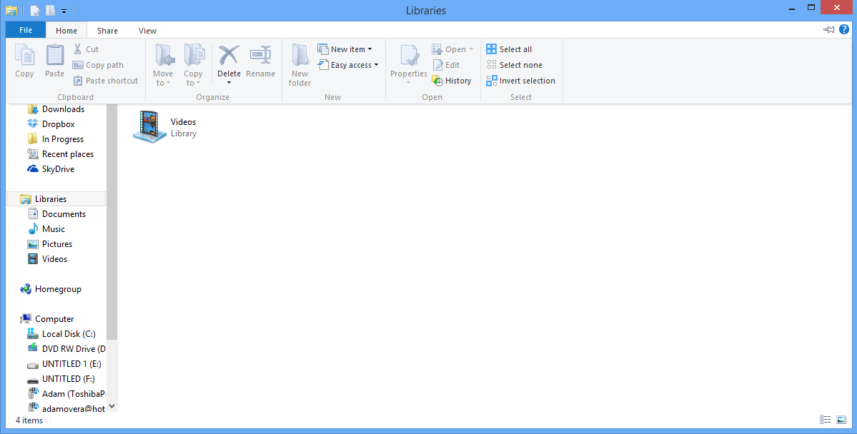
The remaining menu labels, Home, Share, and View, pop-out a ribbon-style menu with their own options. Double-clicking on any of them causes the pop-out ribbon to dock and remain open. The far end of the file menu strip has an arrow button to expand or minimize the ribbon, next to a Help icon that launches Windows Help and Support.
The navigation bar still contains controls for stepping back, forward, and up a directory, as well as a location and search boxes. Likewise, the left-hand pane remains mostly the same as in Windows 7, containing links to Favorites, Libraries, Homegroup, Computer, and Network.
The status bar, which sits at the bottom of the File Manager window, lists the total number of files in a given directory on the far left side. The far right hosts buttons that switch items in the window to a Details view (a vertical list with file information) or large thumbnails.
All told, we're putting Microsoft's new File Explorer in our column of pros favoring Windows 8. Unlike other areas of the operating system, this feature offers power users more control in a cleaner, high-customizable package.
Task Manager
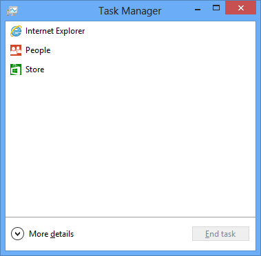
The simplified default view in Windows 8's Task Manager only lists the name of currently-open applications. Simply highlight one and select End Task to kill it. The Task Manager lists desktop applications and Windows 8 UI apps, with nothing distinguishing one from the other.
Although the new Task Manager might look like major downgrade from the previous version, which relayed a lot more information, simply select More details (check the image above) to get all of the old functionality back, plus more.
Better still, Windows 8's Task Manager opens back up in whichever form it was in the last time you closed it. If you're a power user, you won't have to click More details every time you want to look at App history, Performance, or Services.
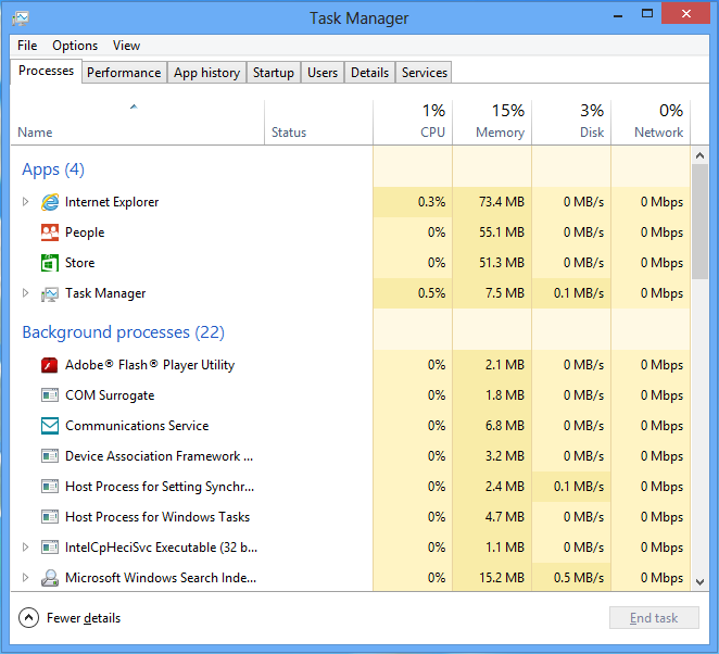
The Process tab details the resources consumed by each running application, along with background and Windows processes. Sort the list according to any of the horizontally-listed categories, allowing you to identify a piece of software chewing up your CPU cycles, your memory, hard drive space, or network throughput.
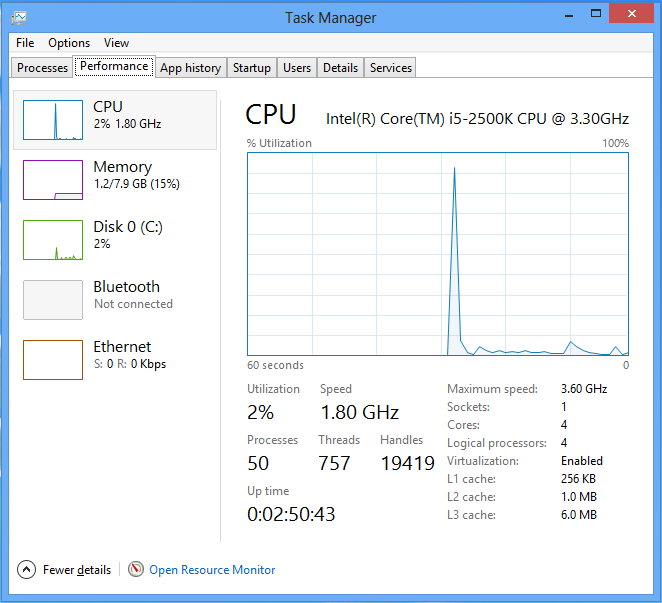
The next tab is labeled Performance, and it contains utilization over time graphs for your processor, memory, disk, Bluetooth connection, and Ethernet-based link. Select any of the graphs on the left side of the screen to make them larger on the right, adding more detailed information.
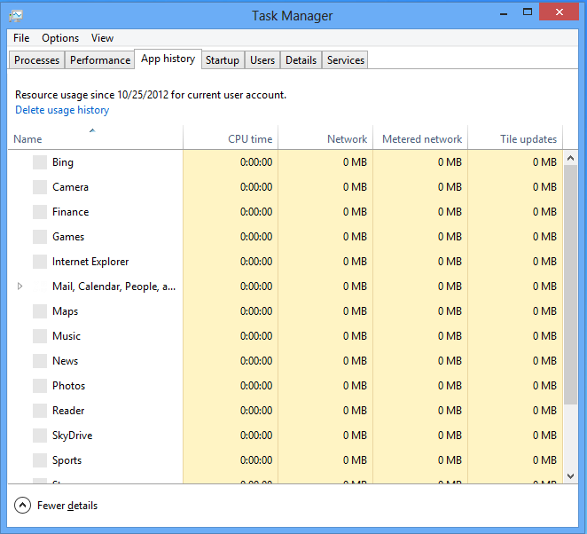
Although the first two tabs don't give you any information you couldn't find in Windows 7's Task Manager (just more, better-organized information), the next tab is completely new. The App history tab lists the total running CPU time, network usage, metered network usage, and the amount of data consumed in updating the live tiles of each Windows 8 UI app.
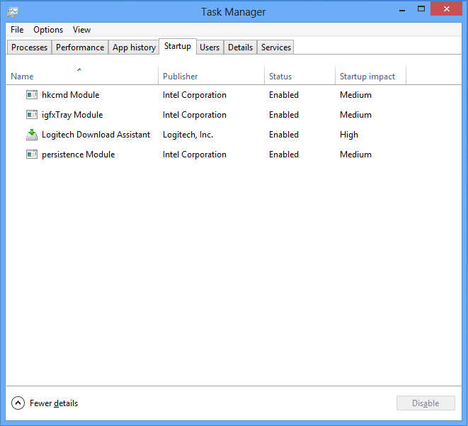
Next is the Startup tab, which lists all of the apps that launch when Windows 8 boots. This replaces the Startup tab in MSConfig (officially, System Configuration) in Windows Vista and 7. Simply select an item and click Disable to prevent that app from launching at startup.
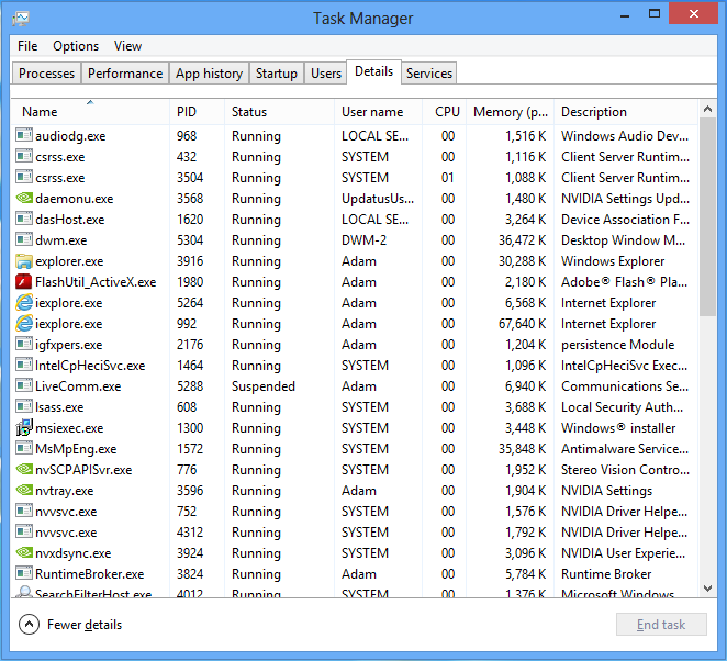
The Users tab is similar to the Processes tab, but sorted by user account. The Details tab is essentially the old Processes tab from Windows 7's Task Manager, and the Services tab appears to be unchanged.
Microsoft's reworked Task Manager is another Windows 8 advantage, both for the casual Windows user and enthusiasts. Even though it initially launches in a simplified view, a more detailed view clearly surpasses the detail available from Windows 7.
Current page: The Windows 8 Desktop And Task Manager
Prev Page Windows 8 PC Settings Next Page Desktop Control Panel-
deftonian decisions, decisions... part of me wants to upgrade, the other part is afraid there's no turning back. I'll keep reading reviews and eventually make the decision. However, thanks Tom's, and not for posting the review, but for not posting another apple article.... :)Reply -
mayankleoboy1 Adam, where are the UI performance improvement benchmarks ?Reply
Win8 is supposed to have everything GPU accelerated, to "better handle big texts" like MS-Word.
So how will you measure FPS in MS-Word ?Plus, how do you measure the 2D performance improvements, the much touted smoothness of win8 ? -
Upgraded to Windows 8 Pro yesterday for $15 on a brand new all in one computer I bought the same day and already, have lots of problems. A lot of my the software I had running on Windows 7 Ultimate worked fine and now don't work at all. The brand new computer I bought with the touch screen... well the touch screen doesn't work and the manufacturer has not driver update to fix it. I'm hoping this will change in time.Reply
-
jasonw223 Just bought 3 copies for my desktop / HTPC / wife's PC. There are quite a few haters out there - but I quite like it. I think if more people gave it a try (like the reviewer) that it would grow on them.Reply
Also, if anyone wants to buy my Transformer Prime, let me know lol. -
agnickolov I'm getting an upgrade copy for my wife's computer. She's struggling with Vista, so this should help I hope... (It better, she's getting a 128GB Samsung 830 as well.) For myself I'll likely stick with Windows 7 Ultimate.Reply -
DjEaZy agnickolovI'm getting an upgrade copy for my wife's computer. She's struggling with Vista, so this should help I hope... (It better, she's getting a 128GB Samsung 830 as well.) For myself I'll likely stick with Windows 7 Ultimate.... why you are torturing your wife... it's hardly an update from vista to 8... the one is slow but windows, the other is quick, but nothing like windows... be a good husband and get her Win7 too...Reply -
SteelCity1981 Without Aero the Windows in Windows 8 looks like something you would see in Windows Windows 9x which makes Windows 7 with Aero look more modern then Windows 8 without Aero. I would even say Windows XP's Luna Windows looks more modern then Windows 8 Windows.Reply
I gave Windows 8 a chance for months in its preview version and not much has changed since the preview version went to the RTM version and always found myself navigating back to Windows 7. I mean Windows 8 felt like an OS that had things i didn't want then an OS that had things I did want. I didn't want a Modern UI as my main screen. I didn't want MS to get rid of the start menu, I didn't want Aeroless Windows that looks like something you would see on Windows 9x. Sure there are programs like classic shell the helps ease the pain of not having a start menu, but that won't be a gurantee to always work esp if MS tries to block it from working with future update patches to Windows 8. And even if they don't patch it all i'm doing is trying to make Windows 8 look like Windows 7 so why don't just stick with Windows 7 instead if that's the case.
Now I think Windows 8 is great on touch screen devices, but for pc's it's another story. Which is why I always thought that MS should have made two diff versions of Windows 8 one for touch screens and one for non touch screens without the Modern UI and with a start menu. Those two simple changes would have made a lot more people that use anon touch screen pc more satisfied with Windows 8.
I read people on here saying people are haters of Windows 8, but those so called haters of Windows 8 reflect on reality off the frustration that most consumers will feel the first time they try to use Windows 8. I think what some of you are missing is the avg consumer that aren't tech savvy doesn't like a lot of change presented to them at once, because it took them a while to understand the Windows that they are using now and making a big change to that will generate almost instant frustration and this is where I feel MS is at a big disconnect with Windows 8 and the avg consumer who are vastly makeup the computer market and when you impose something that seems radical to them and what they have been soo used to for years, it's going to have a big negative effect on that product. -
JOSHSKORN Now that I think about it, I don't even use my Start Button. Everything I need, I have tucked away in quick launch. Very rarely do I find myself looking at my Start Button, unless I need the Control Panel.Reply
