Microsoft to introduce new font in Vista, Office 12 GUI
Get Tom's Hardware's best news and in-depth reviews, straight to your inbox.
You are now subscribed
Your newsletter sign-up was successful
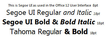
Redmond (WA) - If you change the nuts and bolts of an operating system you might as well also swap the washers. Jensen Harris, lead program manager in Microsoft's Office user experience team, announced in his blog, that the company will replace the good old Tahoma fonts in Windows Vista and Office 12 with an updated font named Segoe UI.
Microsoft so far has not made a big deal of the on-screen fonts it uses in its core applications publicly. In the development process of software, however, the font type and size is crucial, as it is a major factor of the ergonomics of software and influences the readability of information. A decade ago, the company used MS Sans Serif and currently uses the Tahoma font, which was introduced with Windows 98 and Office 97.
According to Jensen Harris, Tahoma is optimized for "for on-screen reading at small point sizes," but the developer team felt that it is time for a more modern font that also takes advantage of Microsoft's ClearType, that is designed to make reading easier especially on LCD screens. "In addition, we wanted a more humanistic, friendly font that would seem less "computer-y" than Tahoma. Most importantly, we wanted the font to take advantage of the research done in Microsoft Typography over the last decade in specifically creating fonts that are easy to scan and read on-screen. These guys know their stuff, and we knew it would make a positive difference in the user interface," Harris writes in his blog.
The result now is Segoe UI. The average will notice little difference to Tahoma, but Harris says that it works well at "both small and larger point sizes" and takes advantage of ClearType. He mentions that the font designers have been working on Segoe UI for "nearly two years." Windows Vista will use the font in 9pt size and Office 12 in 8pt.
"It's amazing to me how much work goes into making a great font - sometimes we send back feedback just about a certain glyph ('g' looks weird in this specific situation) and they tweak the hinting just a bit to improve it," Harris writes. "Tightening up line spacing has been a constant issue - we don't want the Ribbon to take up any more space than necessary, yet Tahoma "cheated" by having certain accents drawn over descenders from the previous line sometimes. We can't allow Segoe UI to use the same trick."
Get Tom's Hardware's best news and in-depth reviews, straight to your inbox.
Tom's Hardware is the leading destination for hardcore computer enthusiasts. We cover everything from processors to 3D printers, single-board computers, SSDs and high-end gaming rigs, empowering readers to make the most of the tech they love, keep up on the latest developments and buy the right gear. Our staff has more than 100 years of combined experience covering news, solving tech problems and reviewing components and systems.

