Comparison of 15" LCD Monitors - Part II
Sony S51

Sony had promised an economical LCD screen in early 2002, so we were expecting it. Its properties, like those of the 15" Continental Edison, remain a mystery, however. The documentation that was supplied tells us that it operates correctly at an ambient temperature of 5° through 35°, that it cannot take more than 0.8 Amps, that it is DDC2B Plug & Play, that entry-level synchronization is adjusted to green, etc. But what about the essential features, such as response time, contrast ratio and brightness? NADA!
Once unpacked, the screen looks like the twin brother of the previous model, the M51, though without the box on the front. The absence of baffles reduces its height, making it look as if it displays a smaller image than normal. This is also explained by the fact that the cabinet is very wide on the right and left hand sides of the display panel.

The results of the pattern tests shown below are equivalents for 9300 and 6500 K.
| Color | Darkest tone displayed | Lightest tone displayed |
|---|---|---|
| Gray pattern | 4 | 255 |
| Red pattern | 16 | 254 |
| Green pattern | 2 | 254 |
| Blue pattern | 12 | 254 |
The gray pattern is often revealing when it starts shifting towards a particular shade. At 9300 K, the S51 panel shifts toward mauve. At 6500 K, it is pinkish. This is not uncommon on LG panels.

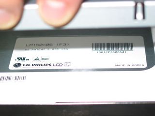
Finally, the response time revealed in the tests did not appear to be any better than that of the SDM-M51D. And for good reason, because even if the panels are not exactly the same, they are very similar in their specifications, and all are made by LG Philips. This means that fast-moving games are out. And on the subject of games, they usually have to be played with the contrast and brightness set to the maximum, whereas for office applications, they should be reduced to medium.
Considering that this screen turns out to be very similar to the earlier M-51, it was logical that we would find the same OSD. The main functions are the phase, clock, the color range (preset or manually adjusted), back-lighting (which ought to be left at its default value, i.e., maximum), etc. In other words, everything is pretty much standard for a screen whose only distinction is its sharp design.
Stay on the Cutting Edge
Join the experts who read Tom's Hardware for the inside track on enthusiast PC tech news — and have for over 25 years. We'll send breaking news and in-depth reviews of CPUs, GPUs, AI, maker hardware and more straight to your inbox.
Most Popular

