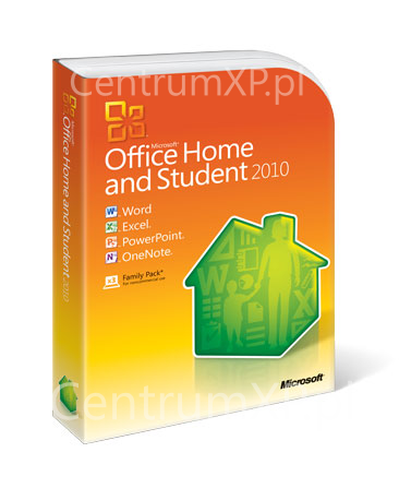
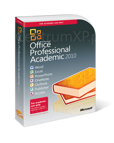
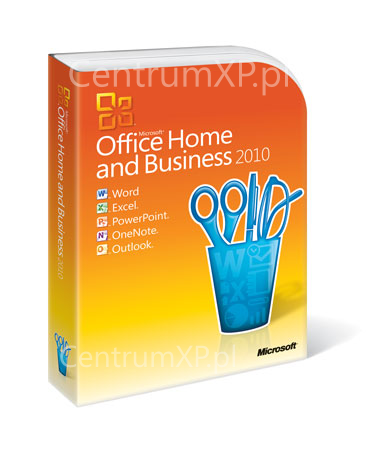
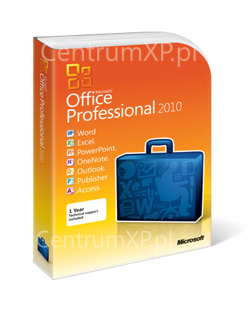
These Could Be the Boxes for Office 2010
My, what bold colors you have.
Microsoft Office – the essential suite of productivity software for many businesses and students. While the launch of this a new version of Office doesn’t command nearly the same amount of fanfare as a new Windows, Office 2010 has many people looking forward to its release.
Those curious to see what Office 2010 looks like can check out the public beta available for download. Those curious to what Office 2010 will look like when it hit stores can peep the images below.
Polish site CentrumXP.pl got its hands on what it believes to be the box art for the next version of Office. While these images are not final and might even be fake, CentrumXP did secure the final box art for Windows 7 months before Microsoft made it official.
What do you think?
Follow us on Twitter for more tech news and exclusive updates here.
Get Tom's Hardware's best news and in-depth reviews, straight to your inbox.
-
counselmancl It could be that I could not care.Reply
Yes, I did open this article just to say that. -
Honis I wonder if those rounded corners drive packagers and store shelf stockboy/girls insane...Reply -
beckstrom12 no they are really easy to assemble and fit nicely, I used to work at best buy in computer department.Reply -
Well the packaging certainly distinguishes this version as you won't be able to mistake these versions for any of the previous versions.Reply
Although you'd think that they would go with packaging that a bit smaller to save on packaging. -
flytrap23 Hang on.......ooooohhhh, shiny. Nice day-glo effect goin on there. Will certainly stand out on the shelf.Reply -
ravewulf The coloring scheme seems a bit.. bland. Bad color combinations too. That and the logos should probably be a bit smaller. They take up a bit too much space and ruin the visual balance.Reply -
tmike "Here are some pictures of the boxes in which some software might be packaged".Reply
What next, photos of the packaging that UPS might use to ship it? Images of an actual roll of tape used to secure the packing boxes? Plaster casts of the UPS truck's tire treads? Naked pix of the UPS guy? (Oh, wait, i have that already).
-
ssalim -Home and StudentReply
-Professional Academic
-Home and Business
-Professional
They are missing:
-Home starter
-Home basic
-Home starter student
-Home starter business
-Home basic student
-Home basic business
-Professional student
-Professional business
-Professional enterprise
-Professional ultimate
-Ultimate business
-Ultimate enterprise
-Ultimate SUPERtimate
-SUPER DUPER
-AWESOME MEGA
-AWESOME SUPER DUPER MEGA
-AWESOME SUPER DUPER MEGA ULTIMATE PRO
-AWESOME SUPER DUPER MEGA ULTIMATE PRO ENHANCED


