Ubuntu 10.10: Maverick Meerkat Benchmarked And Reviewed
It's All In The Looks
Canonical is sticking with the tangerine and aubergine (orange and purple) color scheme first introduced in Ubuntu 10.04 LTS. Some like it, and some don't. But most can agree it's certainly better than the brown themes of past releases. There was no big switch to GNOME 3 in Ubuntu 10.10 as planned, so the GTK2 Ambiance/Radiance themes remain.
Reports from all corners of the blogosphere call the Maverick Meerkat default system themes a minor tweak to those of 10.04 LTS. This just might be the understatement of the year. There are tons of small changes to Ambiance/Radiance in 10.10, that altogether add up to a very substantial overhaul. Let's run through the changes in pictures one by one, starting with the major and obvious, and continuing on to the overlooked details on the next page.
Same Old Boot Splash
Pretty much the only theming element of Ubuntu 10.10 that remains totally unchanged from 10.04 LTS is the boot splash. Unfortunately, so does its tendency to distort with proprietary graphics card drivers. We first noticed this behavior in Lucid using an Nvidia card, and this behavior continues in Maverick on an AMD card. Just as in 10.04 LTS, the 10.10 boot splash remains intact when using the default open source graphics drivers.
Wallpaper
Ubuntu 10.04 LTS brought a shocking change to the Ubuntu color palette, replacing brown and orange with purple and orange. Though the two new colors were prominent, they felt separated and disjointed. Some elements were orange, while others were purple. In Ubuntu 10.10, there exists a much more natural blending of the two colors. Beginning with the new default wallpaper, orange highlights shine throughout Meerkat's mostly purple backdrop. Whereas Lucid's wallpaper was essentially purple with abrupt splotches of orange thrown in. In fact, the default wallpapers of these two versions are a perfect metaphor for the graphical difference between Lucid Lynx and Maverick Meerkat.

Icons
Stay on the Cutting Edge
Join the experts who read Tom's Hardware for the inside track on enthusiast PC tech news — and have for over 25 years. We'll send breaking news and in-depth reviews of CPUs, GPUs, AI, maker hardware and more straight to your inbox.
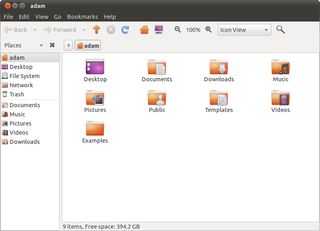
While most of the Home directory icons remain unchanged from Lucid, the Home icon itself has changed from a folder with a house on it to a simple outline of a house. But that wasn't the only icon to undergo a transformation. Navigation buttons like back, forward, reload, and so on now have a softer, rounded, cartoon-like look as opposed to the clean angles in Lucid and earlier versions.

Window Buttons
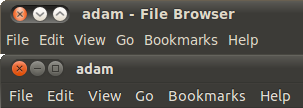
Yes, the much maligned left-hand side window buttons remain, but they've gotten larger and simpler. The buttons in Lucid appear curved, and set into the window title border. The Maverick window buttons drop the rounded look in exchange for more pronounced, flatter buttons. The inset is now barely noticeable, leaving more room for the actual buttons, though the space between them has decreased.

Font
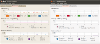
Until now, Ubuntu has always used some form of generic Sans font found on most other Linux distributions. The new font, aptly named Ubuntu, is a full-alphabet version of the lettering used for the new logo introduced in Lucid Lynx. It's clean, clear, and crisp, with a little bit of Star Trek twang thrown in. Below is a screenshot of the 10.04 LTS System Monitor with the old font, next to the 10.10 System Monitor with the new Ubuntu font.

-
"With the appearance of Windows 7 on slate devices in perpetual limbo"Reply
http://www.dailytech.com/HP+Slate+Powered+by+Windows+7+Launches+at+799+is+Business+up+Front/article19953.htm
http://h10010.www1.hp.com/wwpc/us/en/sm/WF06a/321957-321957-64295-3841267-3955550-4332585.html
How is that Limbo? You can buy one right now. -
adamovera I didn't know they were taking pre-orders yet, though HP Slate doesn't ship until the middle of November. Unfortunately, the HP Slate looks like a really half-hearted attempt. Business product? That pretty much means not to get your hopes up. It should have been out much closer to the iPad, but got pushed back repeatedly. Ever since they bought Palm it seems like their Windows efforts in this form factor will take a backseat until they try to make WebOS work - can't blame them really, WebOS is pretty slick and they paid a lot for it. But I still do want to get my hands on the Slate, but look forward to seeing what they do with WebOS more now.Reply -
arkadi If we "put all the issues aside", i love allot of things.....Don't get me wrong, i love to play with Linux at home, but at the moment I prefer to use it at work, in the server room ware it belongs (at the moment). Using it at home it just to much of an effort, to many issues, hardware compatibility etc...Hopefully one day...Reply
Any way Ubuntu came a long way to make it happen....But still few days ago i tried it and few others on a net book, with via chip set and CPU with no luck... -
TomSah "Ubuntu 10.10 Netbook Edition is also a mess. As a netbook operating system intended for actual people to use in a production environment, I have to say that UNE 10.10 should be avoided. From our experience on the Dell Mini 10v, UNE Meerkat is in no way ready for general consumption. Its many bugs and poor performance are just not acceptable or at all realistic for the average end-user. Loading almost anything on UNE 10.10 was clearly sluggish"Reply
Wow. Im running 32-bit Maverick UNE on my Asus eee 1000HA and i have to say that i fell in love as soon as it installed! As soon as i disabled the unity interface to get the desktop interface I was away laughing! I havnt had any of the problems you mention, app startup has been great, no crashes/bugs - And this is my first serious attempt at using a Linux distro. I had a lot of fun tweaking everything to my liking and i now feel like I have the perfect OS for me. Its really strange you had bad experiences like that, must be the dell mini haha. -
adamovera TomSah:Reply
As soon as i disabled the unity interface to get the desktop interface I was away laughing!
Well there you go, you got rid of Unity. I don't doubt it works fine now, LOL. I'm using the 10v with 10.10 32-bit Desktop Edition right now and it's absolutely fantastic, one of the best OSes on this thing by far. The track pad is a nightmare, and there's no fixing that, but in 10.10 it's much better than earlier versions. Tap to click is the best in Windows 7, but drag and drop in Ubuntu is much less maddening than Win7. -
randomizer Just moving the cursor up and down the launcher shows how slow Unity is. The delay between when the cursor moves over an application to when the application's name pops up gives the impression of playing a game at very low framerates.Reply
The Ubuntu font looks ok but it's really only usable in menus and window titles (which I think is all it is used for, fortunately). There's no way such a stylised font could be readable for long periods in a document.
Adam, you should see if any updates fixed the consistently inconsistent HDD to HDD file copy performance.
9503393 said:How come you don't compare the benchmarks to Windows?
Because Windows is not a Linux distro, and this review is for a Linux distro? -
adamovera randomizer:Reply
Adam, you should see if any updates fixed the consistently inconsistent HDD to HDD file copy performance.
As of 10/22/10, when I re-tested the HDD to USB times, they had not.
pinkfloydminnesotaHow come you don't compare the benchmarks to Windows?Workin' on it, stayed tuned. But randomizer is right, this is a review of the new Ubuntu release. As a review of the new version of a software product, this type of article isn't the appropriate forum for that comparison. -
64 bit vs. 32 bit? 32 seems much better all round, stability, compatibility etc.. Is there that much speed difference to be worth using 64 bit?Reply
gvnmcknz
Most Popular

