Comparison Of 15" LCD Monitors - Part I
Get Tom's Hardware's best news and in-depth reviews, straight to your inbox.
You are now subscribed
Your newsletter sign-up was successful
ADI I612
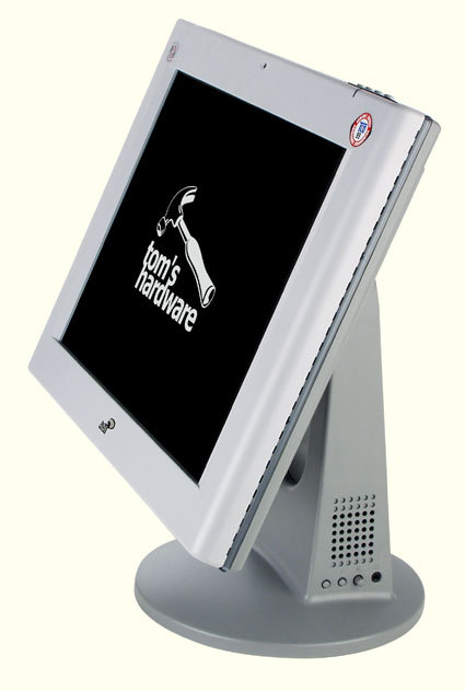
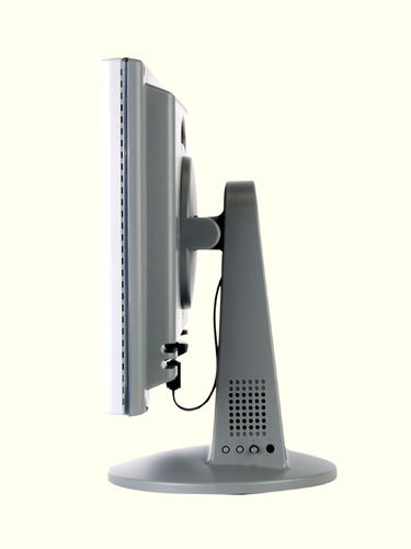
The i612 follows on the heels of the i600, a monitor that was heavily criticized for both its screen and its usability. Like the Belinea 10 15 35 (not currently available in all regions) and the Cornea MP503, the i600 is seated on a no-frills stand instead of a pedestal. Thankfully, the i612 is a perfect replacement for its predecessor. In fact, it almost appears that the manufacturer was in reality attempting to address all the i600's problems.
In addition to the stand, the i612 is also pivot-enabled. But, as we already mentioned in the previous pages, this feature is of little importance on a 15" monitor, since it's only 768 pixels wide, a rather inconvenient size, particularly for Internet applications. Nonetheless, the i612's pivot capability is still a positive feature that might catch a few people's eyes.
As to its usability, the i612 is easy to operate and its screen offers an excellent viewing angle. While the pivot feature can often be complicated on other monitors, it only takes one hand to flip the i612. The base also comes furnished with two speakers, a feature that will only interest those who don't have a sound system yet.
Moving on to the panel, the i612 suffers from several defects common to many other monitors.
Just looking at its specs might make you think that its contrast ratio of 300:1 should be sufficient. Unfortunately, it's not. The optimal settings for this screen are relatively low. Contrast and brightness settings have to be below 50 - they're about 40 here. At that setting, the screen is able to properly display the lightest hues. However, very dark colors are replaced with a simple black.
One of the test images we used is made up of reds, greens and blues that run the gamut from 0 (dark) to 255 (very light). When the contrast and brightness have been set to 40, the screen is able to display different hues ranging from:
- 255 to 34 for red;
- 255 to 31 for green;
- 255 to 34 for blue.
Any lower values are displayed as black. With this kind of display capability, it's impossible to play the latest games, since they're generally very dark. So, when playing DVDs or games, it's a good idea to re-adjust the contrast to 60 and the brightness to 45.
Get Tom's Hardware's best news and in-depth reviews, straight to your inbox.
In that case, the color values range from:
- 234 to 24 for blue;
- 235 to 20 for green;
- 234 to 20 for red.
With these values, dark hues are displayed much better. The downside of these settings, though, is that you lose a lot of the lighter hues, which appear to be pure white. And if you return to office applications, you'll discover that it's impossible to use settings that you optimized for gaming with Windows Office applications - the display is just too bright. So it's back to the initial settings - 40 and 40 for contrast and brightness. And don't forget to reset the automatic adjustment of the phase and clock in the OSD (indispensable for monitors without a digital input such as the i612).
Another drawback is the response time. Start up a game and you'll see right away that the display is rather slow to react. Phantom images are more of a problem for this monitor than for most of the other monitors we tested. Nor does the problem disappear when you switch to surfing the Internet. Scrolling up or down pages will cause the characters to blur.
The i612 is a considerable improvement on its predecessor, the i600. However, it can only really be used in an office setting, assuming that the users won't be relying on Internet functionality. Other displays are much better in an Internet setting than the i612.
NB: The color values used in this test will vary depending on individual preference and lighting conditions. I've listed the values we used just to give you an idea of what this monitor is capable of handling. For the remaining displays, I'll limit my discussion to their overall ability to display light, medium and dark colors.
Current page: ADI I612
Prev Page The Tests Next Page Belinea 10 15 35 (not Currently Available In All Regions)
