Lenovo IdeaCentre Horizon 27 Review: Our First Table PC
The latest all-in-ones look a lot like huge tablets, right? An internal battery adds portability to Lenovo's 27” IdeaCentre Horizon, but is this cool concept still functional as a desktop, or does the push toward mobility sacrifice too much performance?
Brightness, Contrast, Uniformity, And Gamma
Out of the box, Lenovo’s 27” touchscreen offers a native white point of 7900 K. Both the color temperature and contrast ratio of the screen also remain consistent across most brightness levels. A white point of 6500 K is considered neutral and close to the color of midday sun. If a screen measures below 6500 K, it takes on a warmer appearance that leans towards reds and oranges. If a screen measures above 6500 K, it is said to have a cooler appearance that favors the color blue. Cooler color temperatures are common in a retail environment because they make screens stand out next to other displays.
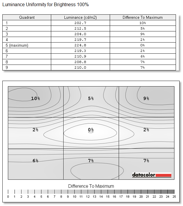
The IdeaCentre Horizon display produces moderately good brightness uniformity with a maximum deviation of 10%. Maximum brightness is less impressive at 225 cd/m2.
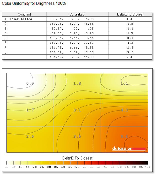
Color uniformity is even less impressive than maximum brightness, with a Delta E of 5.0 between alternate corners. Many people consider a Delta E of 1 to be a noticeable variation, depending on the color.
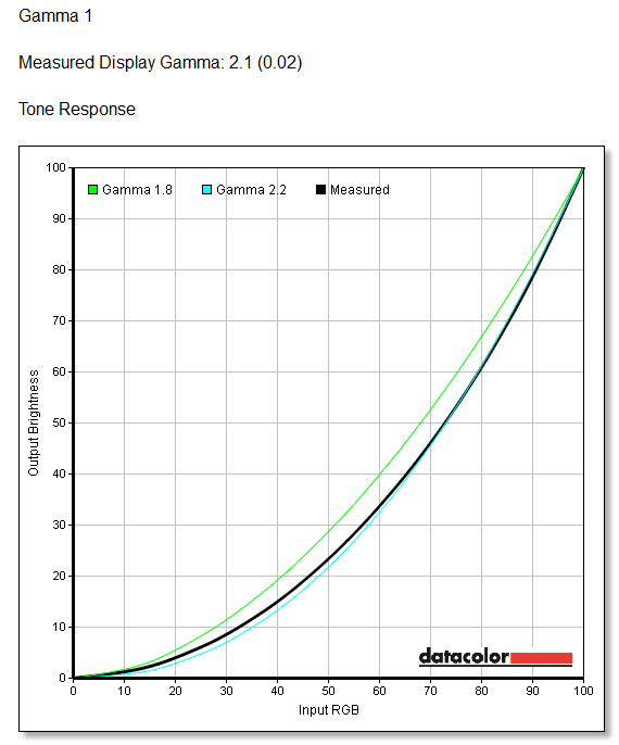
Article continues belowThe IdeaCentre Horizon’s measured gamma response is very close to the standard 2.2 curve used by most Windows systems. A gamma response curve corrects for how the human eye is able to see light and dark colors, and large gamma errors may cause issues with editing or viewing photos. There are no gamma issues present here.
Get Tom's Hardware's best news and in-depth reviews, straight to your inbox.
Current page: Brightness, Contrast, Uniformity, And Gamma
Prev Page Getting To Know The IdeaCentre Horizon Next Page Color Gamut, Accuracy, And Calibration-
sgadadish My only question is why not Haswell?? with all it's benefits for mobility where are the portable with the processor...Reply -
stupiduser As reported on Slashdot IT - "defence agencies of key Western governments such as Australia, the US, Britain, Canada and New Zealand have banned Lenovo gear from being used in sensitive areas, because of concerns that the Chinese vendor has been leaving back doors in its devices for the Chinese Government."Reply
I wish Tom's would aim their incredible testing abilities at these types of claims. I would like to know if MY Lenova is making me vulnerable. -
Crashman Reply
You're right, if we treat this as a huge tablet or an IPC, it looks pretty good. Thanks!11250051 said:Try using this for any length of time as a table pc and your neck and back will be in knots. Not enough gpu power to really make it interesting for gamers but i can see this in industrial, medical applications, schools etc. I can see apu's being used in this application at a much lower price point.
-
rcald2000 I'm a help desk technician and I'll tell you one thing that I've learned about mobile graphics cards in all-in-one PCs; they are a very bad idea. Just yesterday I had the pleasure of troubleshooting a 4-5 year old Dell all-in-one, which had a problem with the video going black for thirty seconds at a time. I of course attempted to upgrade the video drivers, and found out that neither Dell nor nVidia had ever updated the drivers. I believe the computer originally shipped with Vista 32 bit but was advertised as being Windows 7 upgradeable. I base this opinion on the reviews that I read about the machine, and also on the fact that it had both a Windows Vista and Windows 7 logo sticker on it. Dell's site didn't have any drivers newer than 2009 and nVidia's own auto video driver detection application couldn't identify the video card. In conclusion, I think using a mobile video card in a like this size is lame. But I do applaud Lenovo for trying out new ideas. I would have more faith in the form factor if a company like Samsung was behind it. Also, I should mention that I'm typing this very review on my Lenovo X230.Reply
Lenovo X230
i7 ivy bridge processor
16 GB RAM
500 GB 7200 rpm drive
HD4000 integrated graphics
* connected to one external Dell UltraSharp U2412M 24" monitor. -
Ed Chombeau Retired; and need big screen to see ; would take it on car travel but airline travel?Reply -
Crashman Reply11250051 said:Try using this for any length of time as a table pc and your neck and back will be in knots. Not enough gpu power to really make it interesting for gamers but i can see this in industrial, medical applications, schools etc. I can see apu's being used in this application at a much lower price point.
It's about as long and wide as an oversized carry-on bag. Which means you may get it past the gate, or not, depending on how strict the airline staff is being at that gate. And you'd want something to protect the screen.11285869 said:Retired; and need big screen to see ; would take it on car travel but airline travel?


