Xerox XL 795D' Quality Colors
Color rendering on the Xerox XL795D is good. That's a positive point for a monitor that targets the professional market. As usual, we used our LaCie BlueEye calibrator to evaluate the monitor's color fidelity. Calibration resulted in the following graph:
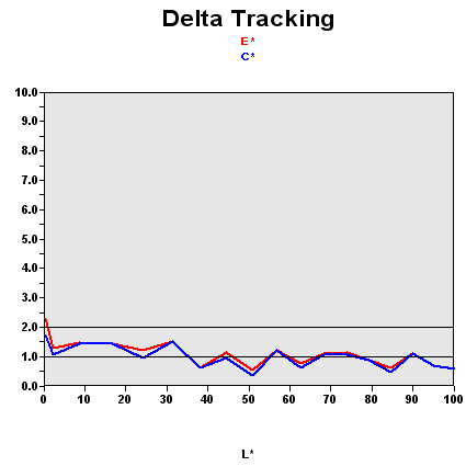
As we've pointed out before, this graph shows the difference between the desired color shade and the one actually displayed.
- If DeltaE >3, the color displayed is visibly different from the theoretical one - in other words the user can tell the difference.
- If DeltaE <2, LaCie considers the calibration to be successful, with a slight difference remaining, but one that will be almost imperceptible to the user.
- If DeltaE < 1, the color fidelity is excellent.
In this case, few colors are perfect, but all are calibrated or can be calibrated DeltaE < 2. In addition, the rendering of darker colors is very good. It's rare to get a DeltaE < 2 for values that are near 0 on the curve. That means that the Xerox XL79D does a good job of rendering blacks.
| Black spot | White spot | Contrast |
|---|---|---|
| 0.41 | 187 | 456: 1 |
Some monitors render darker colors well but lack depth. This is not the case with the XL795D. Its black value after calibration was 0.41. That's not the best value we came up with during our tests, but the average is somewhere around 0.50. So this is not bad at all. The brightness is sufficient for ordinary use, so there's no problem in that department. It's nice to see that Xerox hasn't given in to the temptation of boosting the brightness. It's a trick many manufacturers use to give the user the impression that the blacks are deeper than they are in reality. They don't hesitate to use values of 400 or even 500 nits, which is obviously of no use under normal conditions. Xerox hasn't done that; the XL795D has intense blacks and a reasonable level of brightness.
And the contrast is quite stable:
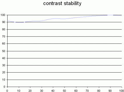
This curve indicates the contrast value measured for a given brightness adjustment on the OSD. In theory, brightness and contrast are two independent parameters, and good contrast is required regardless of the brightness adjustment. Unfortunately, that's not the case in practice.
The X-axis is the brightness adjustment, contrast is on the Y-axis. Contrast is expressed here as a percentage of the maximum contrast value measured using the ANSI standard method. The maximum contrast was for a brightness adjustment of 100%.
With the XL795, you'll be able to change the brightness as you see fit without losing too much contrast in the 30%-70% range. So contrast stability is no problem either.