Why you can trust Tom's Hardware
Our HDR benchmarking uses Portrait Displays’ Calman software. To learn about our HDR testing, see our breakdown of how we test PC monitors.
For the best HDR, it doesn’t get better than a QD-OLED like the XG27ACDNG. It doesn’t have the brightness of a high-end Mini LED, but that tech can’t deliver the deep black levels required for truly impactful imagery. The XG27ACDNG switches automatically and offers four HDR-specific picture modes with adjustment capability.
HDR Brightness and Contrast
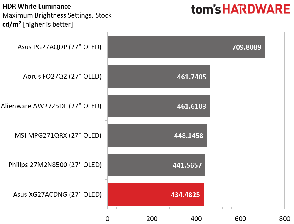
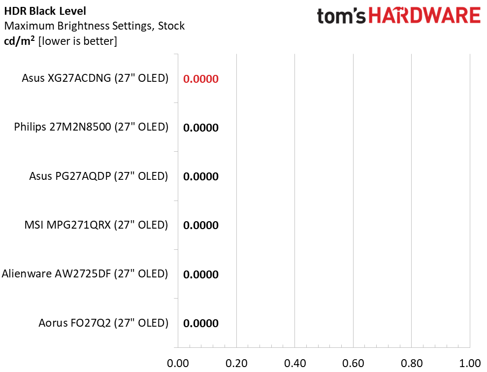
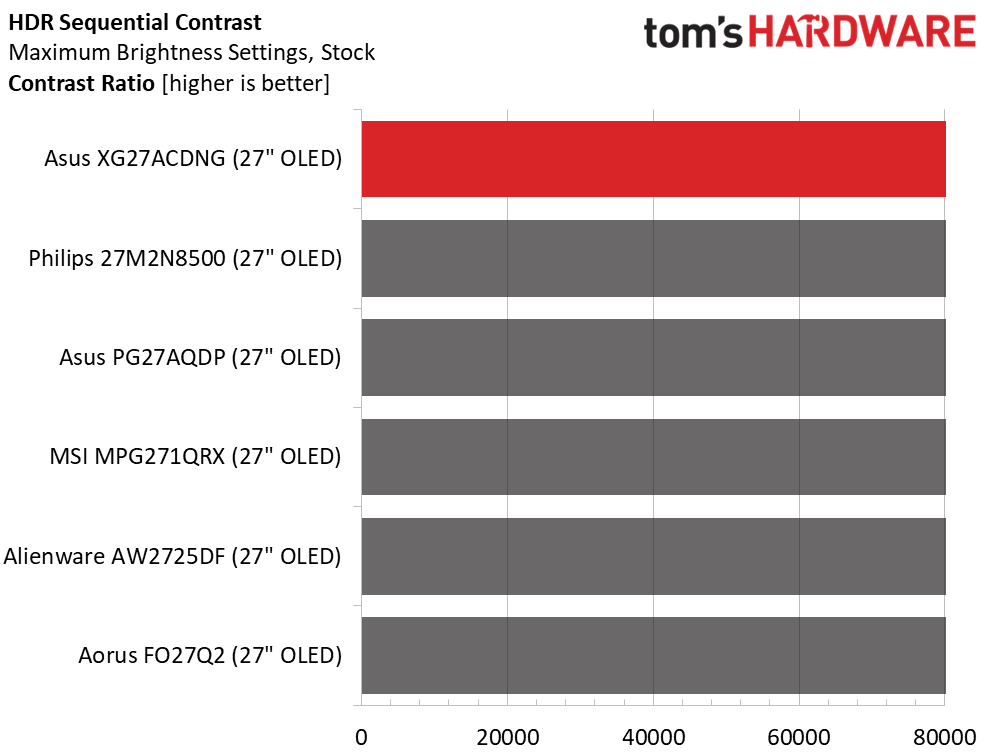
The XG27ACDNG defaults to Gaming HDR mode, but I found better luminance tracking using the TrueBlack option. This doesn’t affect the peak output, which is just over 434 nits for a 25% window. Asus claims 1,000 nits for small highlights, and I have no reason to doubt this. If you want higher output, the PG27AQDP stands above the others. But for practical use, there is barely a difference between any of the six monitors.
Grayscale, EOTF and Color
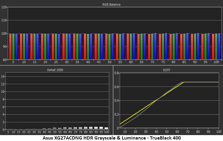
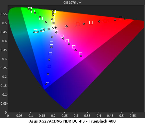
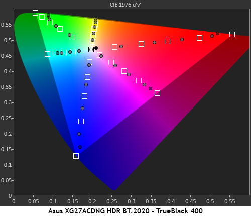
The XG27ACDNG’s HDR grayscale tracking is visually perfect with no errors greater than 1dE which is impressive. The EOTF tracks closest to reference in the TrueBlack mode where it runs just a bit dark until meeting the line at 40%. Some shadow detail might be a little hard to see but this is a minor issue.
In the color test, the XG27ACDNG makes full use of its large gamut to create vivid and saturated HDR. The measured points are past their targets but in a linear progression so there is no loss of detail. Textures are crisp and clean in all areas of the image. And there are no visible hue errors.
The BT.2020 chart is impressive and shows red coverage of around 90%, green at almost 80% and blue hitting 95%. This is excellent performance.
Test Takeaway: The XG27ACDNG’s HDR performance is on par with what I saw in the SDR tests. Color is very saturated and spot-on accurate. Luminance tracking is close to reference so textures and detail is as clear as it possibly can be. This is an awesome monitor for HDR content and whether you watch video or play games, it will look amazing.
Get Tom's Hardware's best news and in-depth reviews, straight to your inbox.
MORE: Best Gaming Monitors
MORE: How We Test PC Monitors
MORE: How to Buy a PC Monitor

Christian Eberle is a Contributing Editor for Tom's Hardware US. He's a veteran reviewer of A/V equipment, specializing in monitors. Christian began his obsession with tech when he built his first PC in 1991, a 286 running DOS 3.0 at a blazing 12MHz. In 2006, he undertook training from the Imaging Science Foundation in video calibration and testing and thus started a passion for precise imaging that persists to this day. He is also a professional musician with a degree from the New England Conservatory as a classical bassoonist which he used to good effect as a performer with the West Point Army Band from 1987 to 2013. He enjoys watching movies and listening to high-end audio in his custom-built home theater and can be seen riding trails near his home on a race-ready ICE VTX recumbent trike. Christian enjoys the endless summer in Florida where he lives with his wife and Chihuahua and plays with orchestras around the state.
-
Mr Majestyk So who cares about colour accuracy for a gaming monitor? No way in hell I'd buy OLED for productivity.Reply -
UnforcedERROR Reply
Color accuracy is arguably one of the most important parts of a monitor, regardless of intended use.Mr Majestyk said:So who cares about colour accuracy for a gaming monitor? No way in hell I'd buy OLED for productivity. -
HardwiredWireless Reply
Exactly. The dinky little screen is a major drawback for gaming or productivity for me. After using an ultra wide curved screen this little thing is unusable regardless of it's claimed features. Instead of the old OLED screens the better looking and newer tech is using individually lighted LEDs which eliminated the overnighting in darker areas but still allows for a much brighter picture that is the Hallmark of traditional LED screens. I'm more interested in the area of the screen that are showing an image than the areas that are turned off anyways to be honest, but for the folks that like the non image darkness the new systems offer that too.Mr Majestyk said:So who cares about colour accuracy for a gaming monitor? No way in hell I'd buy OLED for productivity. -
UnforcedERROR Reply
MicroLED and QDEL are unlikely to be on the market anytime soon. Also, ultrawides and this monitor serve entirely different gaming demographics. One is for immersion across most games and the other is primarily aimed at FPS. But ultimately caring about color accuracy isn't just a productivity thing, it makes anything you interact with look better.HardwiredWireless said:Exactly. The dinky little screen is a major drawback for gaming or productivity for me. After using an ultra wide curved screen this little thing is unusable regardless of it's claimed features. Instead of the old OLED screens the better looking and newer tech is using individually lighted LEDs which eliminated the overnighting in darker areas but still allows for a much brighter picture that is the Hallmark of traditional LED screens. I'm more interested in the area of the screen that are showing an image than the areas that are turned off anyways to be honest, but for the folks that like the non image darkness the new systems offer that too. -
HardwiredWireless Reply
More accurate color representation doesn't necessarily look better It just looks more accurate It might look better to a person if they switch to hue slightly to lower or to the redder. What looks better is subjective what looks more accurate is objective.UnforcedERROR said:MicroLED and QDEL are unlikely to be on the market anytime soon. Also, ultrawides and this monitor serve entirely different gaming demographics. One is for immersion across most games and the other is primarily aimed at FPS. But ultimately caring about color accuracy isn't just a productivity thing, it makes anything you interact with look better. -
UnforcedERROR Reply
Yes, but what you're failing to understand is that if you start with accurate, and you don't like it, it's easier to adjust to your preferences. When something is wildly out of spec it's not only harder to correct, it may be impossible depending on the error variance. You always want to start with the best possible outcome, not the worst.HardwiredWireless said:More accurate color representation doesn't necessarily look better It just looks more accurate It might look better to a person if they switch to hue slightly to lower or to the redder. What looks better is subjective what looks more accurate is objective. -
HardwiredWireless Reply
The starting point has nothing to do with the ease of changing the settings.UnforcedERROR said:Yes, but what you're failing to understand is that if you start with accurate, and you don't like it, it's easier to adjust to your preferences. When something is wildly out of spec it's not only harder to correct, it may be impossible depending on the error variance. You always want to start with the best possible outcome, not the worst. -
UnforcedERROR Reply
Doesn't it? Does inaccuracy make changing them easier? What exactly is your point supposed to be? If you don't have to adjust for accuracy out of the box is that not easier at a base level than if you want that performance and it can't achieve it? Even if you prefer it inaccurate, that initial built-in inaccuracy may not be to your liking, which makes the situation even more convoluted.HardwiredWireless said:The starting point has nothing to do with the ease of changing the settings.
There's no logic to the point you're making.
EDIT: Also who was even talking about ease of changing settings? I'm talking strictly about color accuracy, not functionality. Sorry, I'm not trying to be a jerk, I just find it to be non-correlative to the discussion. -
HardwiredWireless Reply
The point I'm making is if I want my screen to be purple I still have to make the same adjustments whether it's slightly green slightly blue slightly orange or dead on perfect to start with. There's also a huge difference between transmitted light and color and reflected light and color which you would understand if you've ever done any printing. What you see on the screen does not really look like what it is when it's printed out. A Pantone color on the screen looks far different than a Pantone color in the book.UnforcedERROR said:Doesn't it? Does inaccuracy make changing them easier? What exactly is your point supposed to be? If you don't have to adjust for accuracy out of the box is that not easier at a base level than if you want that performance and it can't achieve it? Even if you prefer it inaccurate, that initial built-in inaccuracy may not be to your liking, which makes the situation even more convoluted.
There's no logic to the point you're making.
EDIT: Also who was even talking about ease of changing settings? I'm talking strictly about color accuracy, not functionality. Sorry, I'm not trying to be a jerk, I just find it to be non-correlative to the discussion. -
UnforcedERROR Reply
But your point makes no sense: what if the color cannot be calibrated to your preference because the errors are too present to properly correct? This can be a problem to some degree, depending on the quality of display. Again, starting from perfect and adjusting to preference will always be better than starting in error and adjusting to preference. Obviously you can use calibration tools to get closer to a preferred spec, but not everyone has access to those (and, again, it may not be able to fully correct for errors depending on severity).HardwiredWireless said:The point I'm making is if I want my screen to be purple I still have to make the same adjustments whether it's slightly green slightly blue slightly orange or dead on perfect to start with. There's also a huge difference between transmitted light and color and reflected light and color which you would understand if you've ever done any printing. What you see on the screen does not really look like what it is when it's printed out. A Pantone color on the screen looks far different than a Pantone color in the book.
Also, you don't have to lecture me on the difference between print and screen. I'm a professional designer as well as a trained lithographer and fine artist. There is very little I don't know about color theory. Trust me, I'm keenly aware that you want a Pantone book to properly match colors if you're not working in CMYK (and if you're in CMYK between printers you should press-check). All that said, color accuracy extends into film media, it's not just about professional use.
